How to Create a Split Screen Website
20th November 2022, updated 18th Sep 2024

Introduction
Creating a split screen website with Lay Theme is pretty easy!
What is a split screen website?
It is a website split into two. Both halves are independently scrollable:
Update your Lay Theme version to at least 4.9.1 to make this work properly.
Step 1: Create the Left Half
The left half is the navigation half. The right half is our normal content.
For the left half we create a page.
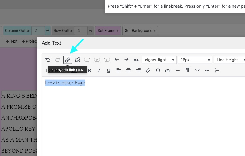
In your admin panel go to "Pages" and create a new page. Now add texts that are linked to other pages or projects.
That page looks kind of like this:
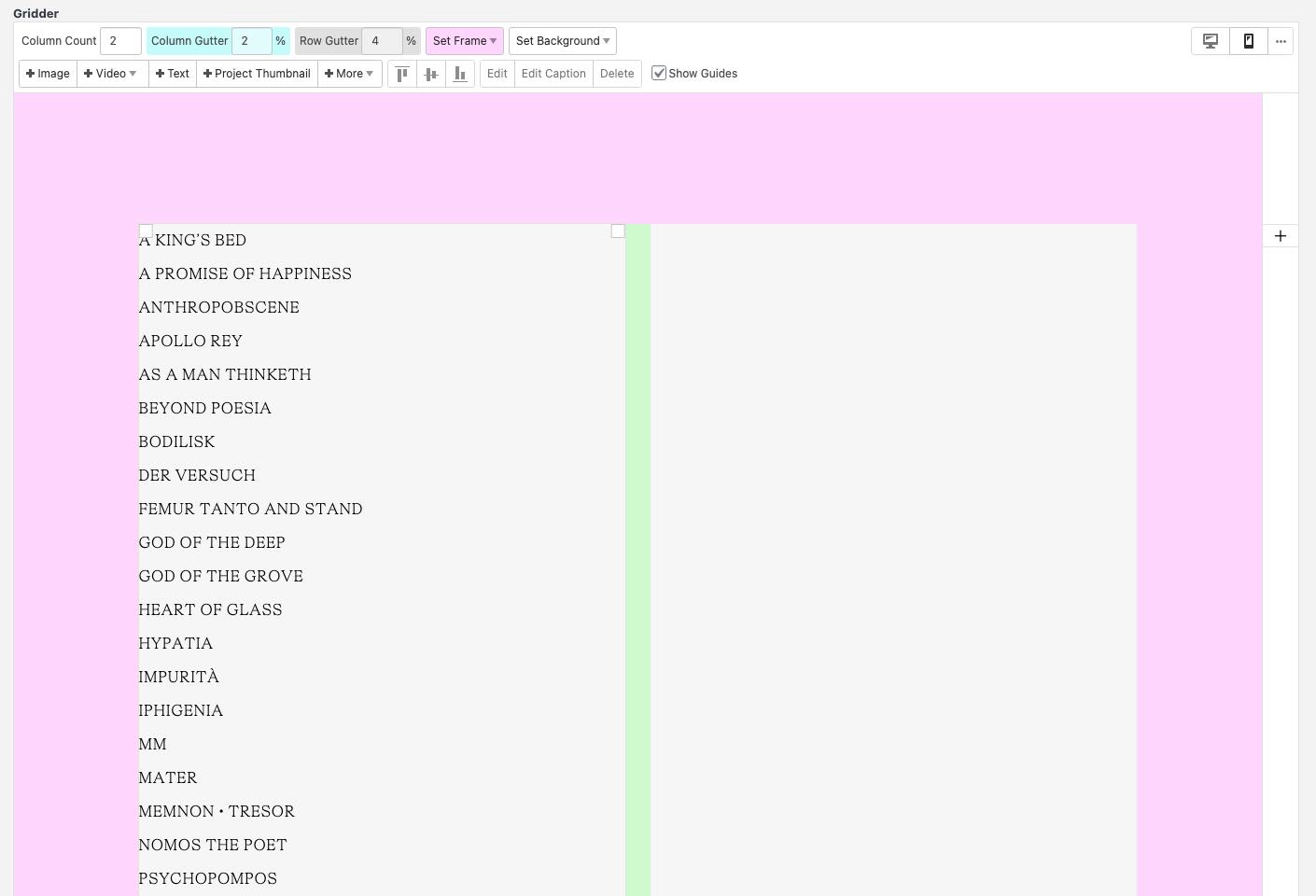
Use the Button "+Text" to add a text and use the "link" button to link texts to other pages.
You can also just add a "Project Index" element if you need links to all of your projects. Style it in the project index element modal so its just a basic list of text. I think that works better design-wise for this use case instead of the default style.
On the example website in the video above, the left half is just a project index element.
2: Set the Left Half as a Footer
Now go to "Lay Options" → "Footers".
In here, set the page we just created as the footer for everything.
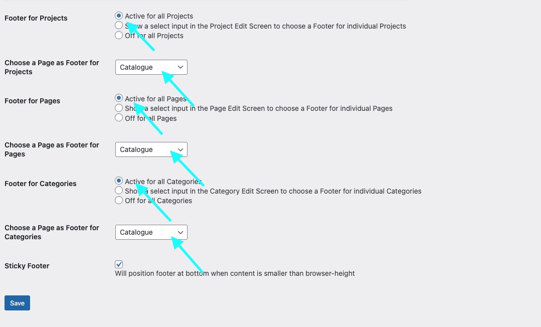
Now in "Customize" → "Frontpage" set a project as your frontpage. If you set the footer as the frontpage, we will just see the footer twice :D.
Step 3: Use Custom CSS
Go to "Lay Options" → "Custom CSS & HTML".
Now paste this CSS into "Custom CSS for Desktop Version":
/* using "body>.lay-content #grid" instead of "#grid" for compatibility with "Page Overlay / Burger Feature" */
body>.lay-content #grid,
body>.lay-content #footer-region {
    height: 100%;
    position: fixed;
    top: 0;
    overflow-y: scroll;
    overflow: -moz-scrollbars-none;
    scrollbar-width: none;
    -webkit-overflow-scrolling: touch;
}
body>.lay-content #footer-region {
    left: 0;
    width: 50%;
}
body>.lay-content #footer{
    box-sizing: border-box;
    min-height: 100%;
}
body>.lay-content #grid {
    right: 0;
    width: 50%;
    box-sizing: border-box;
}
::-webkit-scrollbar {
    display: none;
}
That CSS basically just puts our footer to the left and the content to the right. Also it makes it scrollable, hides the scrollbars and makes it scroll smoothly on tablets.
You can use this CSS additionally to add a grey line between the two halves.
#footer-region {
        border-right: 1px solid #ccc;
    }
If you want your left half to have a different width than the right half change the 50% to other values. Just make sure both #footer-region and #grid are 100% width combined.
Step 4: Special Options we need to use
We're using these two options so the website behaves correctly when we click a link.
Go to "Lay Options" and in there set "Transition" to "None".
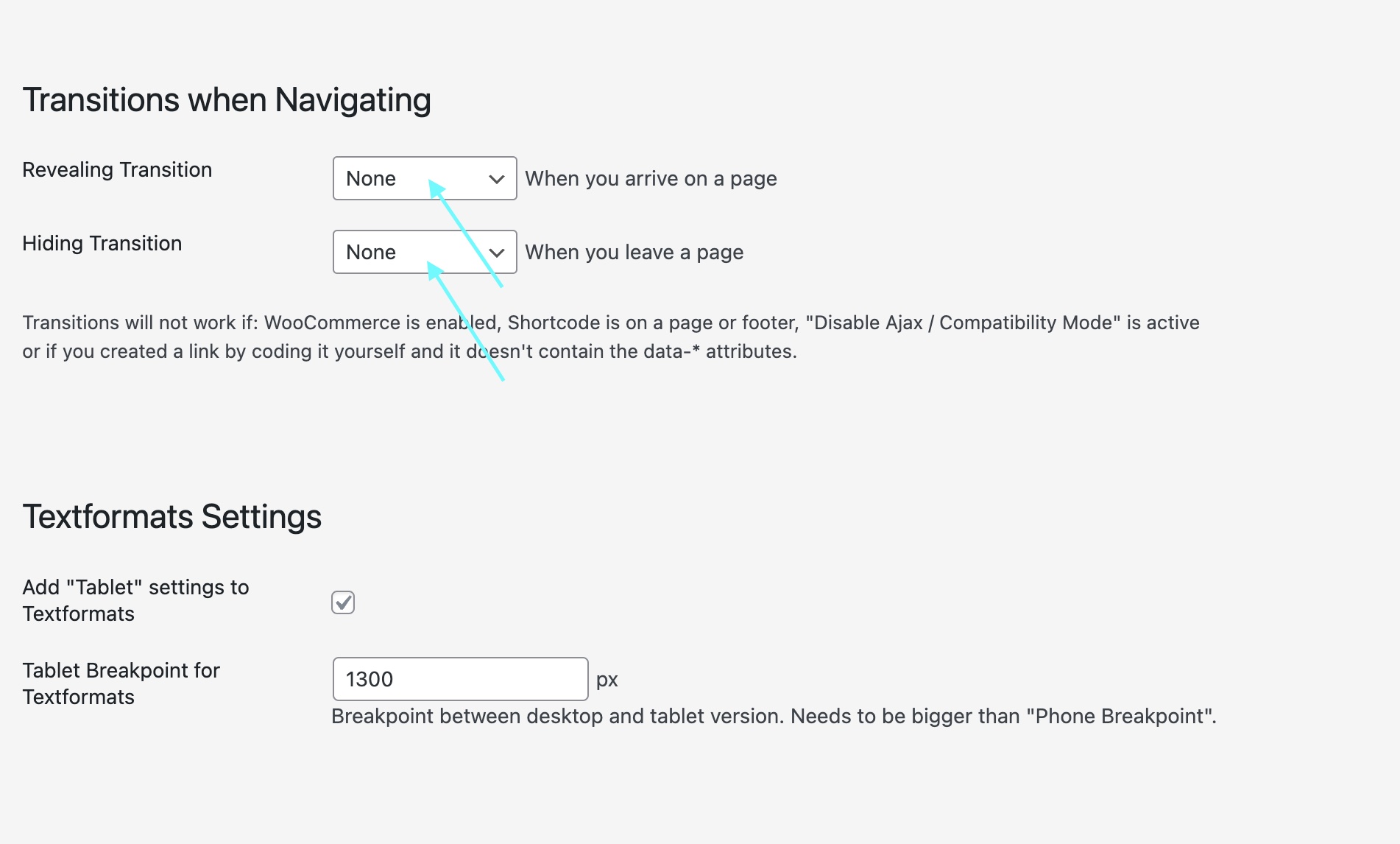
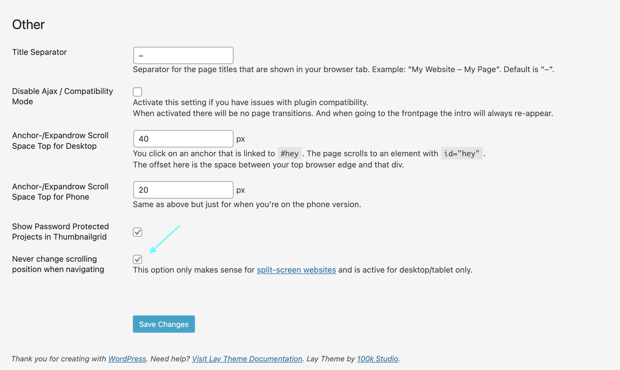
At the bottom in the "Other" section, check "Never change scrolling position when navigating":
Step 5: Phone Version
I believe a split screen website is only good for a desktop or tablet website. Phones are just too narrow I think.
That's why we added the splitscreen CSS to "Desktop CSS" only in "Step 3".
So what about your phone version?
Just use the custom phone layout feature for your footer and your frontpage.
Change the content of your footer and frontpage so its the content of a normal frontpage and a normal footer.
Congratulations! 🥳
That's it. You just created a split-screen website!
Take a look at our Instagram for more tips.