How to Create a Desktop Burger Menu
or Info Overlay
12th June 2026
Introduction
A Page Overlay is any page that opens on top of your site — typically used as a desktop burger menu, an "about" or "contact" overlay, or a newsletter signup that slides in when a visitor lands on the page.
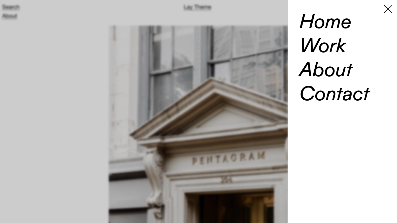
Below: a "+" burger in the top-right of a site. Clicking it slides a small menu overlay in from the right; clicking the same icon again (now an "X") closes it:
Plus-icon burger top-right; click opens a Projekte / Über Uns / Leistungen / Karriere menu and closes it again
Enable Page Overlays
First enable the feature in Lay Options → Extra Features. Turn on Page Overlays (Desktop Burger Menu Feature) and save your changes.
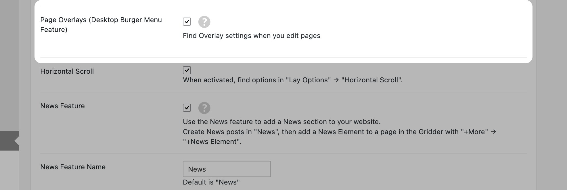
Enable Page Overlays in Lay Options → Extra Features
After this, the Overlay settings appear when you edit a page.
Turn a page into an overlay
Any page can be turned into an overlay (projects can't — for project-only overlays see Projects Overlays).
Edit the page you want as the overlay. In the right-hand sidebar you'll find the Overlay metabox. Tick Use as Overlay and a Configure Page Overlay button appears, with a live summary of the current settings below it:
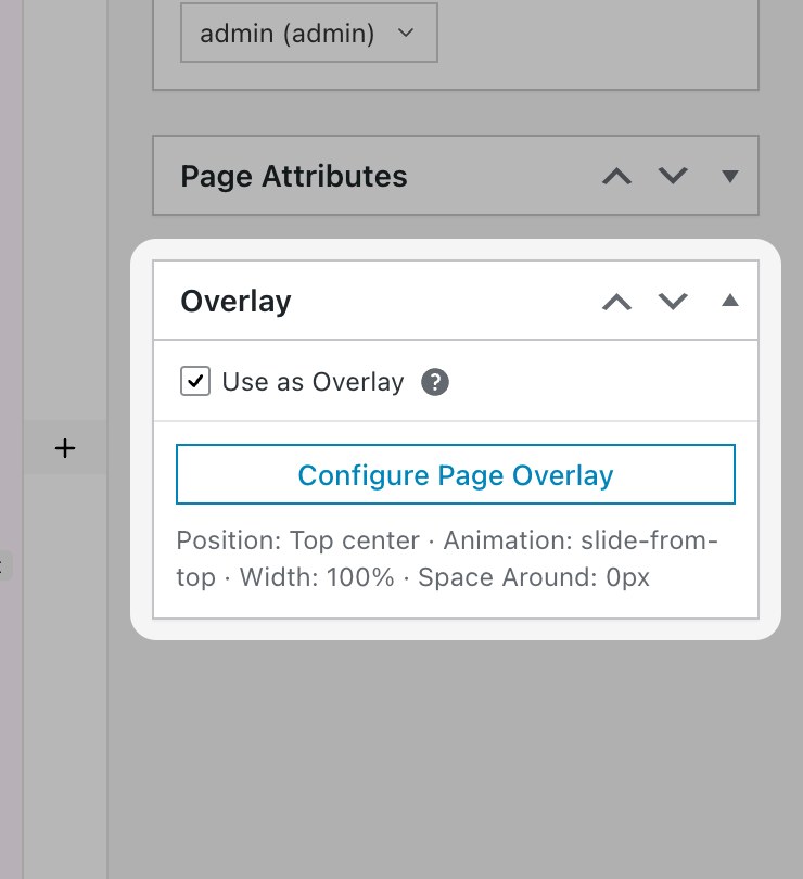
The Overlay metabox on the post sidebar — tick the box, then click Configure
Clicking Configure Page Overlay opens a modal with six tabs that cover position/animation, the burger icon, the X close icon, link styling, backdrop, and a bunch of behavior toggles:
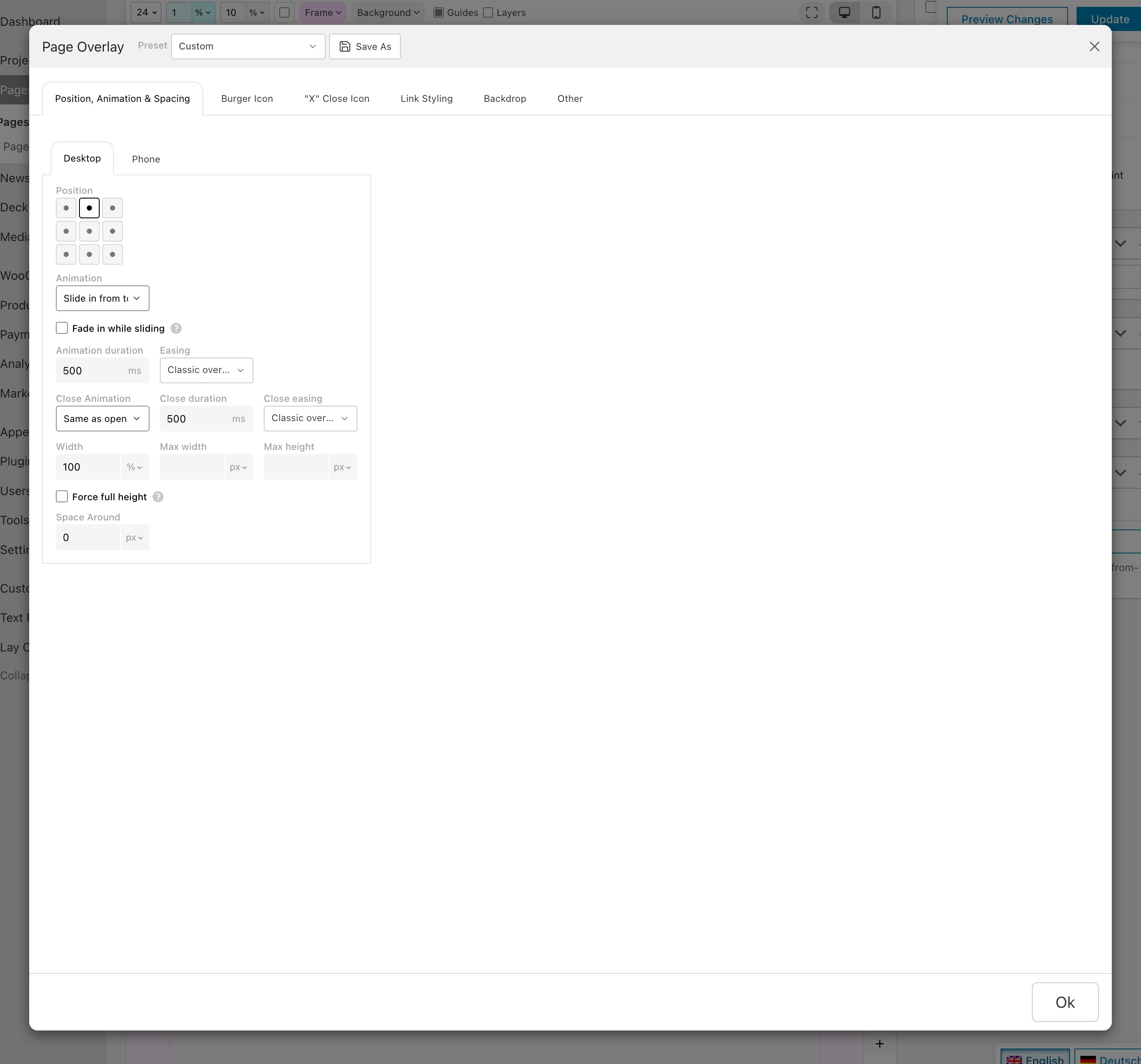
The Configure Page Overlay modal — six tabs across the top, controls below. The next sections zoom into each group.
At the top of the modal, a Preset dropdown + Save As button let you save a finished configuration as a preset and reuse it on other overlay pages.
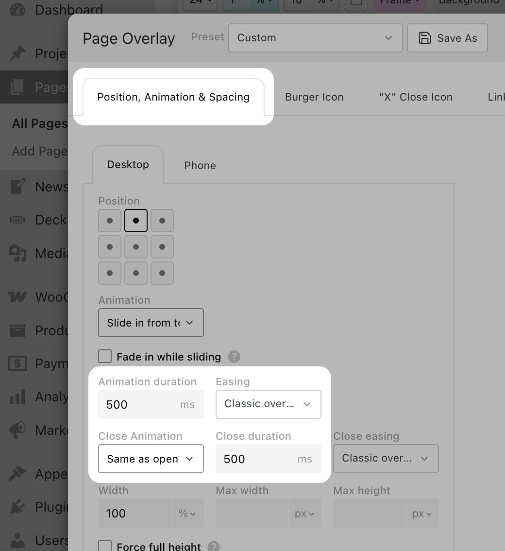
Position, animation, sizing
The first tab is where you decide where the overlay sits, how it animates, and how big it is. Every group also has its own Desktop / Phone sub-tabs so the overlay can behave differently on mobile.
Position
A 3×3 grid pins the overlay to any corner, edge or to the center:
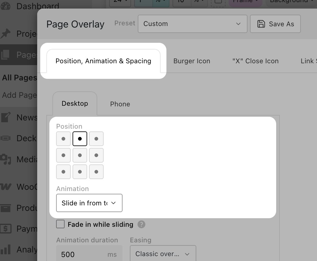
The 3×3 position grid plus the Animation dropdown
The Animation dropdown right under it picks the open animation: No Animation, Fade, or one of four slide directions. The Fade in while sliding checkbox (one row below) combines the slide with a fade so the overlay grows in instead of popping.
Easing and Close animation
Below the open animation you can fine-tune timing — and pick a separate animation for closing:
Open and close durations + a long list of easing curves
- Animation duration & Easing — duration in ms plus a long list of curves: linear / ease / ease-in / ease-out / ease-in-out, plus the named curves Smooth, Decelerate, Snappy, Slow Ease, Overshoot, Anticipate and Classic overlay. Overshoot and Anticipate are great for playful, springy menus.
- Close Animation defaults to Same as open. You can override it with a different slide direction (e.g. slide in from the right, slide out to the top) and set a separate Close duration + Close easing.
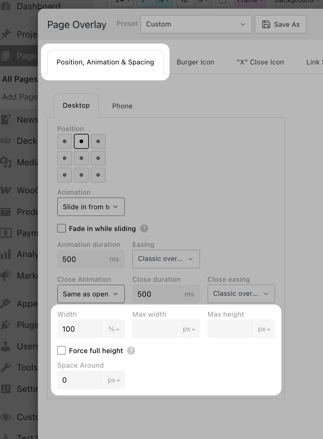
Width, max sizes, spacing
Width / Max width / Max height + Force full height + Space Around
- Width is the overlay's width as a percentage (or px) of the viewport. Set 100% for a fullscreen overlay; set 50% for a side-panel.
- Max width and Max height cap the overlay on big screens.
- Force full height makes the overlay fill the browser height even if its content is short. (If you'd rather keep the content-driven height, see the one-row tip at the end of this article.)
- Space Around adds outer padding so the overlay doesn't stick to the viewport edges.
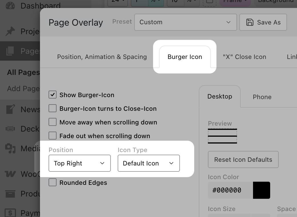
The Burger Icon
The icon visitors click to open the overlay. With Show Burger-Icon ticked, the icon appears on every page of your site.
Icon Type
Pick one of four icon styles in the Position + Icon Type row:
Pick a corner and an icon style — Default, Plus, Custom (your own SVG) or Text
- Default Icon — the classic 2–4 line burger.
- Plus Icon — a small "+" mark. Pairs naturally with a Minus close icon (see the next section).
- Custom Icon — upload your own SVG.
- Text — type a word like "Menu" or "About". The text styles like the rest of your site's UI.
Three checkboxes above the row control behavior:
- Burger-Icon turns to Close-Icon — when the overlay is open the same icon morphs into an X so visitors can close it without a second control.
- Move away when scrolling down and Fade out when scrolling down — get the icon out of the way as the visitor reads.
Customize the look
Below the icon-type row, a Preview + a grid of style controls let you tune the icon:
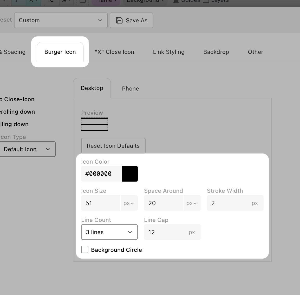
Color, size, stroke width, line count + line gap, and a Background Circle toggle
Icon Color, Icon Size, Space Around, Stroke Width, Line Count (2/3/4 lines for the Default burger) and Line Gap are self-explanatory. Rounded Edges softens the line caps; Background Circle turns the icon into a circular pill button — useful when the icon sits on a busy page.
The "X" Close Icon
The icon visitors click to close the overlay, rendered inside the overlay (not on the page). Use this when the burger icon doesn't morph into a close icon, or when you want the close button somewhere different from the burger.
The controls mirror the Burger Icon tab — same Position, Icon Type (with Minus Icon in place of Plus), Icon Color/Size/Stroke Width, Rounded Edges and Background Circle. Tip: pair a Plus burger with a Minus close — a "+" that closes as a "−" reads very naturally.
Link Styling
Style the links inside the overlay separately from the rest of the site, so a burger menu can have its own typography. Three accordions cover the three link states:
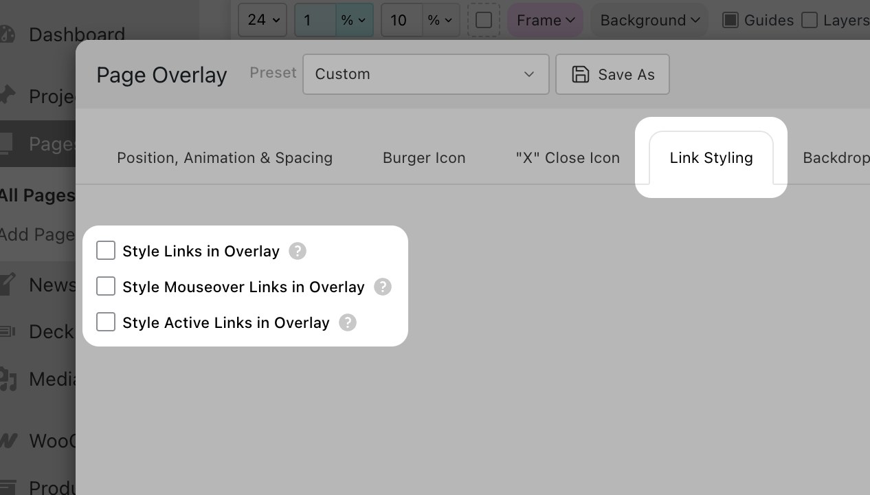
Style Links / Mouseover Links / Active Links — open each accordion to override its styles
The Style Active Links in Overlay accordion is the one that gives you the "current page is highlighted in the menu" effect — turn it on, set a distinct color or underline, and the menu shows visitors where they are.
The Backdrop
The dim/blurry layer behind the overlay that visually separates it from the page underneath:
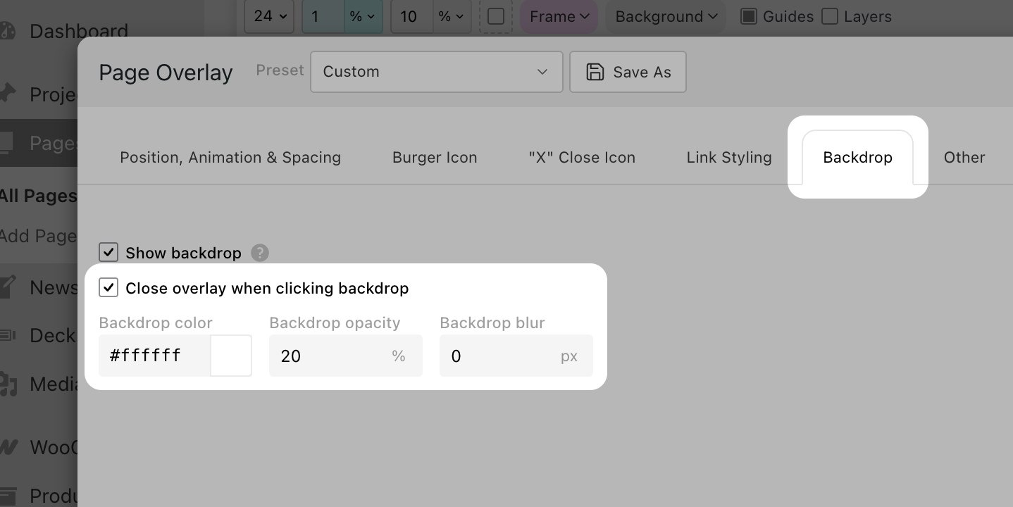
Click-to-close, color, opacity and Gaussian blur (frosted glass)
- Close overlay when clicking backdrop — handy for menu-style overlays.
- Backdrop color + Backdrop opacity — pick a tint and translucency.
- Backdrop blur — a Gaussian blur in px gives a frosted-glass look behind the overlay.
Other settings
A grab-bag tab covering everything that didn't fit elsewhere. The behavior switches come first:
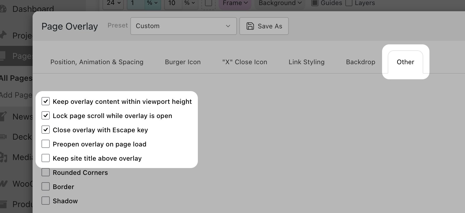
Behavior switches — viewport clipping, scroll lock, Escape key, preopen, site title above overlay
- Keep overlay content within viewport height — clip and scroll inside the overlay instead of letting it run past the bottom.
- Lock page scroll while overlay is open — stop the page underneath from scrolling.
- Close overlay with Escape key.
- Preopen overlay on page load — useful for "welcome" / "newsletter signup" overlays that should show immediately.
- Keep site title above overlay — the site title (and Fixed Header if you use one) stays on top of the overlay instead of being covered.
Below those, three checkboxes style the overlay container itself:
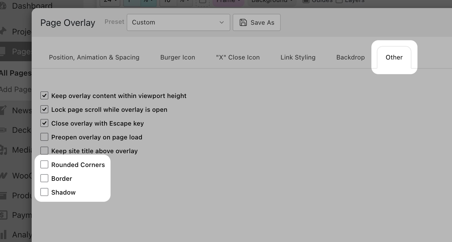
Rounded Corners, Border, Shadow — each toggle expands to its own settings
Each toggle expands into its own settings: corner radius in px, border width/color, shadow blur/offset/color.
Open the overlay from a menu link
Any link to the overlay page will open it as an overlay — not just the burger icon. So you can drop the overlay into your regular menu in Appearance → Menus (or anywhere on the site, really). Click the link and the overlay opens, exactly the same as clicking the burger.
This pairs nicely with multiple menus when you want different overlays in different parts of the site.
One-row height tip
If your overlay's content doesn't fill the browser height and Force full height isn't what you want either, there's a simple Gridder trick:
- On the overlay page, set Frame top and Frame bottom to 0 (pink "Set Frame" button).
- Make sure the layout has only one row. Right-click that row and choose Use Browser Height for Row Height.
- If you need stacked elements inside, use the Stack element instead of adding more rows.
- Use Space and Offsets → Space Above / Space Below on individual elements to pad them inside the row.
This way the overlay's content is exactly one viewport tall — clean both visually and on every screen size.
That's it 🍔
You now have a burger menu (or an about-page overlay, or a signup popup). Pop over to our Instagram for more tips.