Custom CSS Styling
Custom CSS makes it possible for you to change the look of your website even more!
For these tutorials you need to know some HTML and CSS. Also it's very helpful if you know how to use your browser's inspector/developer tools. If you don't know HTML and CSS I encourage you to look at the free interactive course on Khan Academy.
MDN has great resources too: learn CSS, learn HTML, learn JavaScript
And here is a video tutorial about using a browser's inspector/developer tools: https://khanacademy.org/computing/computer-programming/html-css/web-development-tools/a/using-the-browser-developer-tools
In "Lay Options" → "Custom CSS & HTML" you can enter your own CSS for the desktop and mobile versions of your site.
CSS based on current page
If you want to insert CSS only for a specific page, you can use the "Edit CSS" button in the Gridder:

Let's say your website has a white background and your menu and site title are black.
But your about page has a black background. Because the site title and menu are black too, you can't see them anymore on the about page.
Now you need to use Custom CSS to make your menu and site title *white* for your about page.
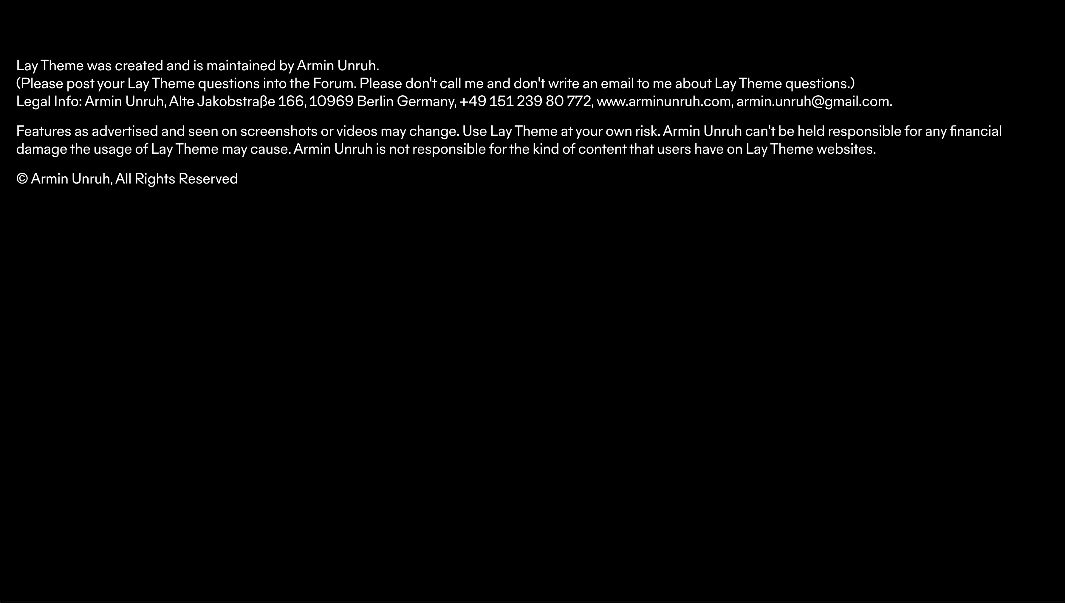
This is what our about page looks like
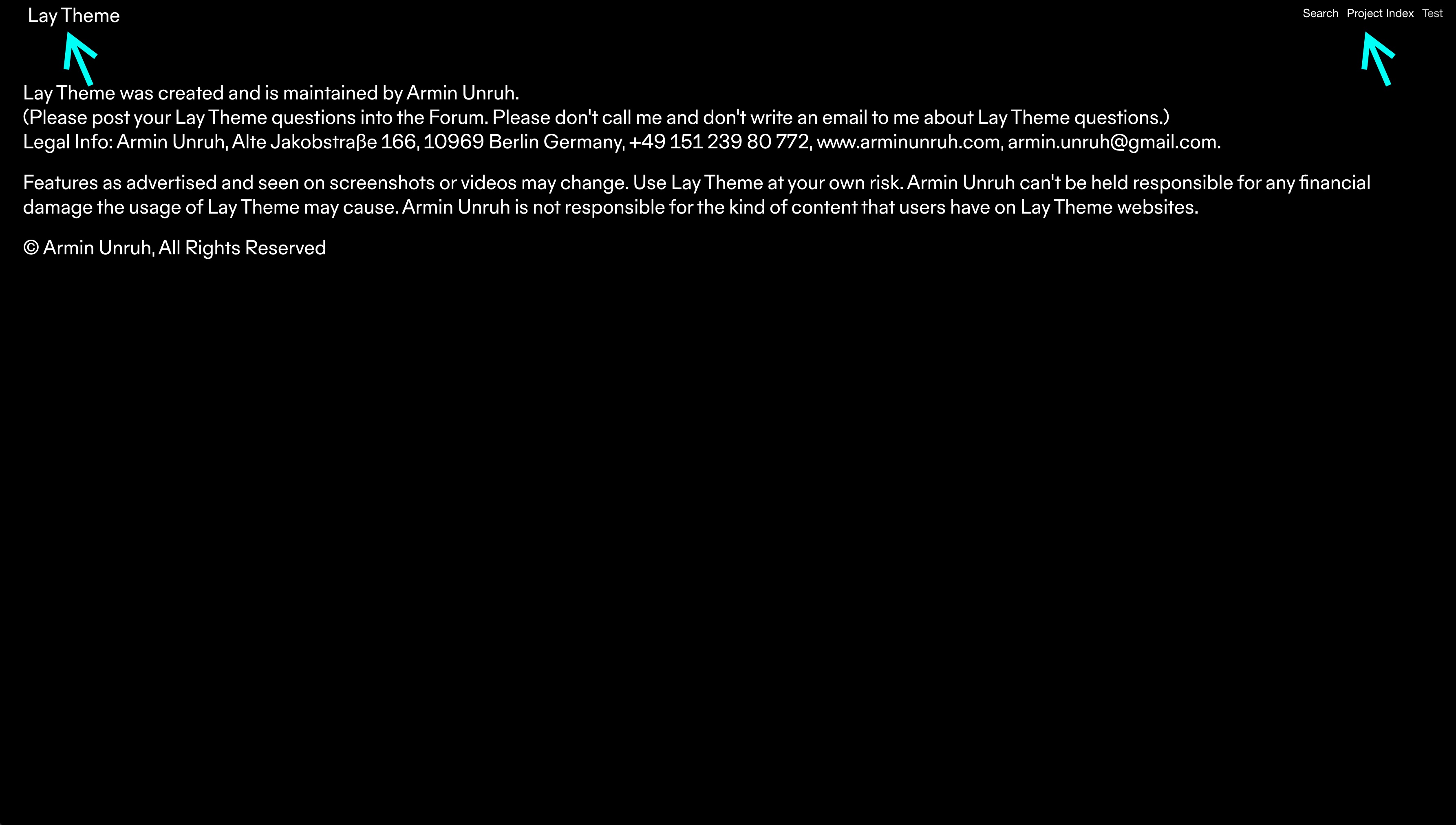
This will be our final result. A white site title and menu on the about page.
Step 1: Open the Inspector
Go to your website's about page and open the inspector of your favourite browser. I use Chrome, so I just right click and choose "Inspect".
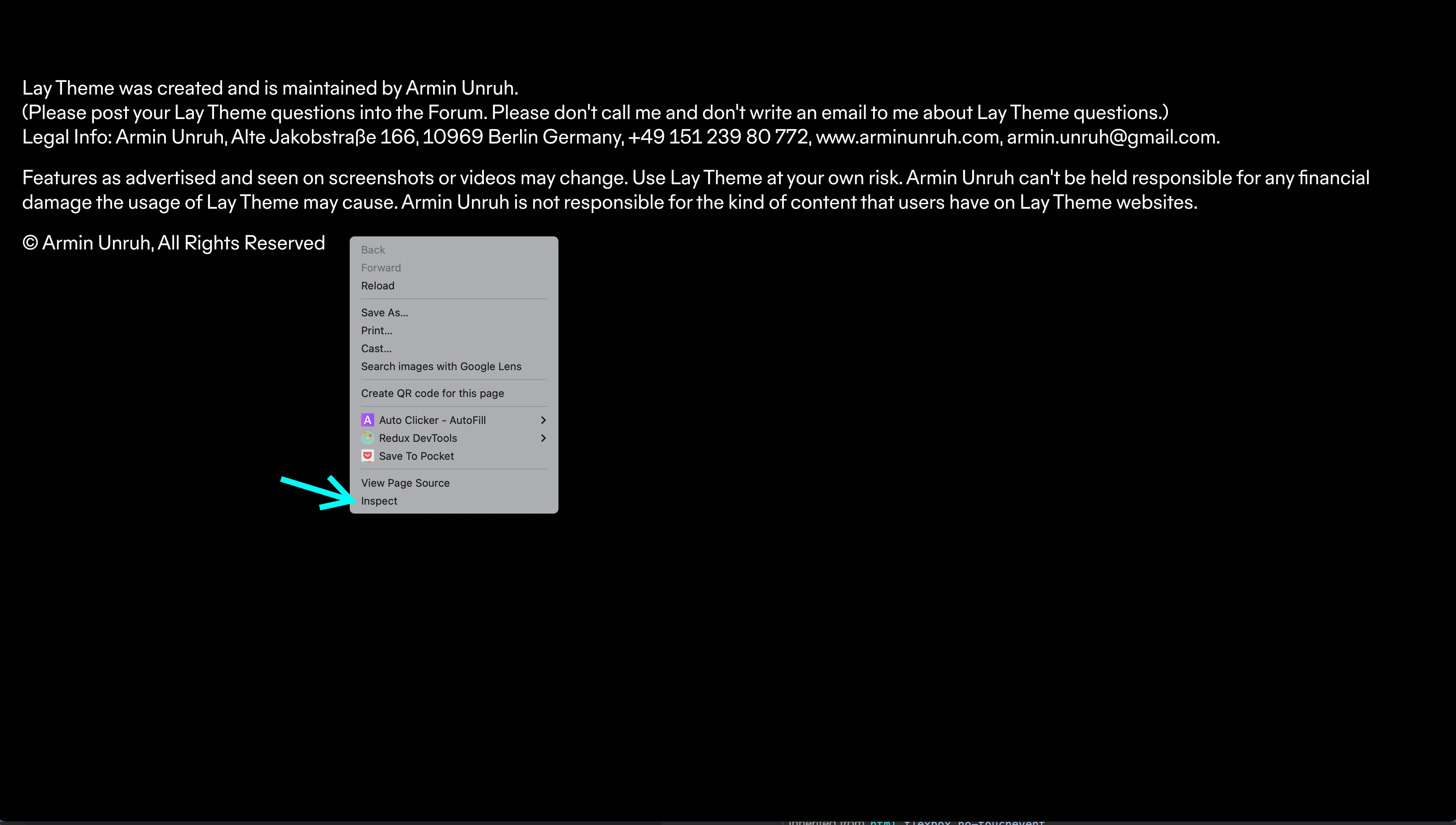
Right click on your page and choose "Inspect"
Step 2: Get the body classes
Take a look at the opening <body> tag at the top. It has the classes type-page, id-10 and slug-about.
The type can be for example "type-project", "type-page" or "type-category". Right now we're on the about page, which is of "type-page". The id is a number that is unique to the respective type. The slug is the name of the page. We can use this info to target this page specifically and do changes with CSS.
The CSS selector for this page is body.type-page.id-697{ … }. Or just body.slug-about{ … }. The slug is not unique in case you have another page, category or project with the same name.
Step 3: Get the classes for menu and site title
Now we need to find out the selectors for the menu and the site title. Just use the selector tool of your browser. Here we use Chrome.
Find the ![]() selector tool in the upper left corner of the inspector.
selector tool in the upper left corner of the inspector.
Click the selector icon, then click the site title. The corresponding HTML element will be marked in the inspector.
As you see in the inspector the site title has the selector:
.sitetitle.txt .sitetitle-txt-inner span{ … }And the selector for the navigation elements is:
nav.primary a span{ … }Step 4: Write CSS
So far, our CSS for making the navigation and site title white on the about page is:
/* site title */
body.slug-about .sitetitle.txt .sitetitle-txt-inner span{
	color: white;
}
/* navigation */
body.slug-about nav.primary a span{
	color: white;
}
Enter this CSS into the field "Custom CSS" in "Lay Options" → "Custom CSS & HTML" and take a look at your about page.
This works, but it's not perfect yet. The site title and navigation items need to stay white on mouseover and their underline needs to be white on mouseover too:
/* site title */
body.slug-about .sitetitle.txt .sitetitle-txt-inner span{
	color: white;
}
/* site title mouseover */
body.slug-about .sitetitle.txt:hover .sitetitle-txt-inner span{
	color: white;
}
/* site title mouseover underline color */
body.slug-about .sitetitle.txt:hover .sitetitle-txt-inner span{
	border-bottom-color: white;
}
/* navigation */
body.slug-about nav.primary a span{
	color: white;
}
/* navigation mouseover */
body.slug-about nav.primary a:hover span{
	color: white;
}
/* navigation mouseover underline color */
body.slug-about nav.primary a:hover span{
	border-bottom-color: white;
}
Last thing we want to do is make the color change animate when you navigate to your about page. For this, we will use CSS transitions. Add this code to your CSS:
/* site title transition */
.sitetitle.txt .sitetitle-txt-inner span{
	transition: color 600ms ease;
	-webkit-transition: color 600ms ease;
}
/* navigation transition */
nav.primary a span,
nav.laynav .current-menu-item>a span{
	transition: color 600ms ease, border-bottom-color 600ms ease;
	-webkit-transition: color 600ms ease, border-bottom-color 600ms ease;
}
This is our final result. The site title (top left) and menu (top right) are white now only on the about page:

Create a button style
Attention! This is an old example. If you want a button, just edit a text element, select a text and choose one of the three button styles: ( 1 ), ( 2 ) or ( 3 ).
First, we create a text element with a link. Then we give it a HTML class of "buttonstyle" to later target this textelement with CSS.
Step 1: Give a text element a HTML class
To give an element an HTML class right click it in the Gridder and click "Set HTML class and id" as shown in the video below.
Right click the element and choose "Set HTML class and id"
Step 2: Write CSS
Now we enter some CSS in "Lay Options" → "Custom CSS & HTML" → "Custom CSS".
.buttonstyle a{ … } is the CSS selector to target links inside anything of the class "buttonstyle".
.buttonstyle a:hover{ … } is targeting the mouseover state of our button.
.buttonstyle a{
	padding: 15px 20px;
	display: inline-block;
	background-color: #e8e8e8;
	border-radius: 3px;
	line-height: 1;
	text-decoration: none;
	border-bottom: none;
	color: black;
	opacity: 1!important;
	white-space: nowrap;
}

.buttonstyle a:hover{
	background-color: #f0f0f0;
	text-decoration: none;
	border-bottom: none;
	color: black;
	opacity: 1!important;
}
padding: 15px 20px; is the inner space around the text.
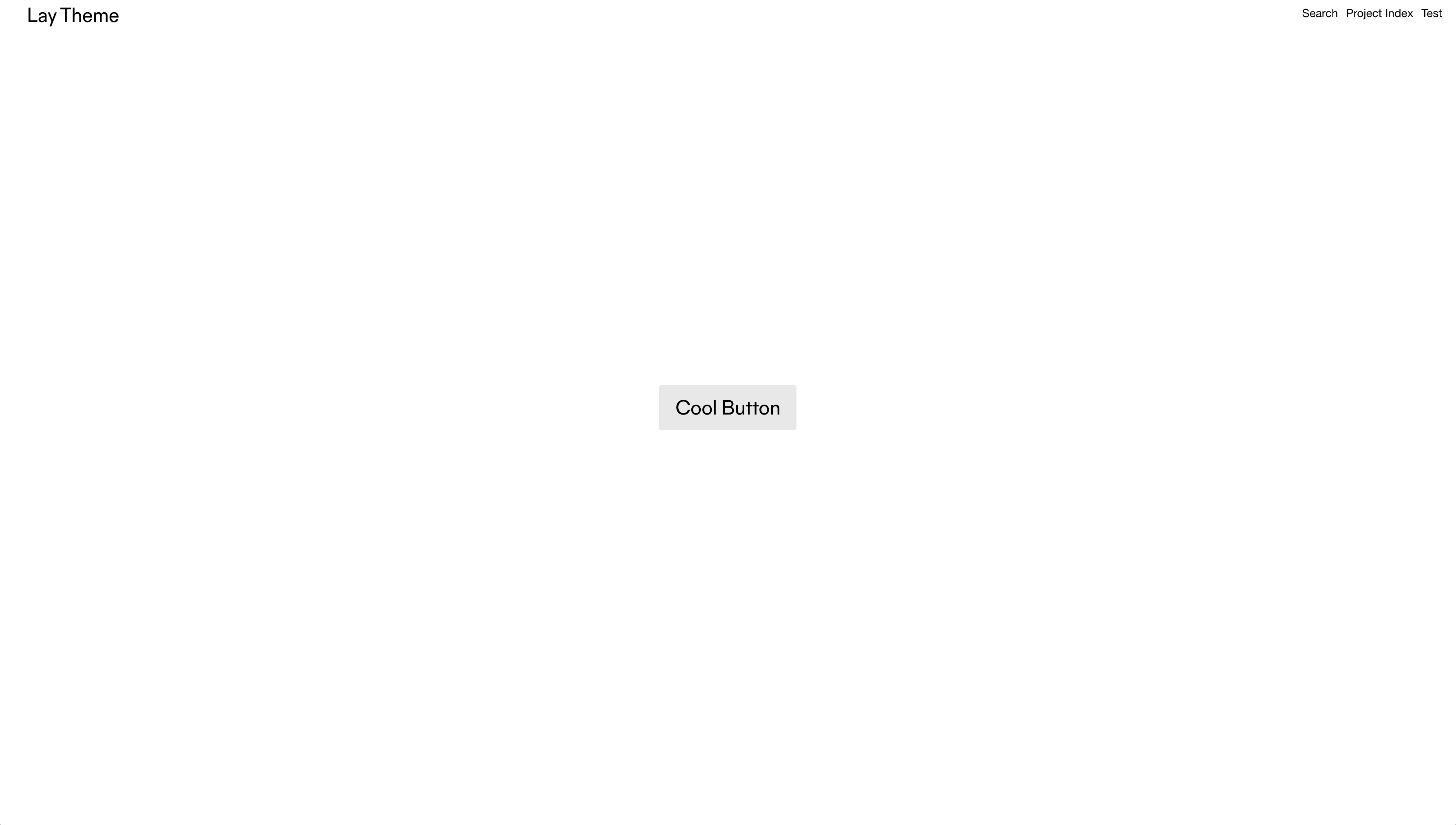
display: inline-block; makes the button have the width of the text "Cool Button".
border-radius: 3px; makes the button have rounded corners.
white-space: nowrap; makes sure there is no line break of the button text.
The CSS for color, opacity and border-bottom is there just to make sure we are overwriting the styles of "Links in Texts" that you might have set in "Customize" → "Links in Texts".
This is our final result for our button look:
Hide an element on mobile
First we add the HTML class "hideformobile" to an element in the Gridder. Just right click an element and click "Set HTML class and id". Then enter "hideformobile" for the class (without the quotes).
Now we add the following CSS to "Lay Options" → "Custom CSS & HTML" → "Custom CSS for Mobile Version"
.hideformobile{
	display: none;
}
If you want to highly customize your phone layout please take a look at Custom Phone Layouts.